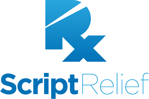
ScriptRelief is the largest prescription discount card in the US. Previous ScriptRelief marketing efforts involved marketing the product under a large array of different brand names. Seeking to both digitize and finally unify their brand again, ScriptRelief needed a logo that clearly communicated the aim of the product, with being trustworthy and standing up to both digital and print application.
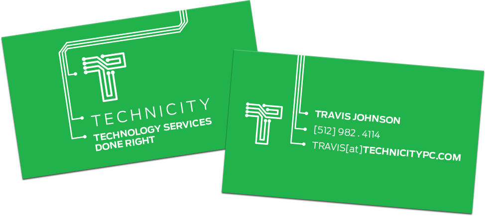
Technicity is an IT services provider based in Texas. They needed a strong logo to launch with, so we developed a strong mark and identity system built around one of the most ubiquitous technological components, the circuit board.

The Technicity identity system was expanded into their print collateral, continuing the circuit board language and playing with it to cleverly compliment the medium.
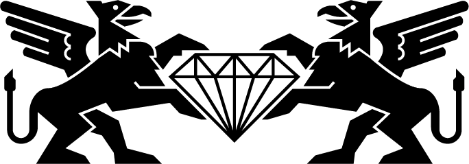
The Griffins and Diamond comprise the logo for Lones Gemologists and Appraisers, a family-owned gemology practise based in Miami. The griffins hark from the Lones family crest, rendered in a strong geometric manner, meant to invoke the geometry of gemstones as well as german trademarks.
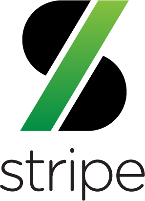
A concept logo developed for the payment processing company, Stripe. It was designed to be a modern reference to a certain well-known symbol of currency while clearly communicating the company even at very small digital application sizes.
GoPago, another payment processing startup, needed a logo that communicated their unique strength, speed, and wanted something that was more dynamic and approachable than their corporate competitors.

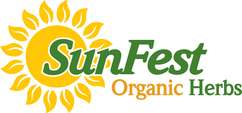
SunFest Organic Herbs is a 100% organic farm in Okeechobee Florida. When they signed their first major distribution deals, they needed an identity for packaging and promotion. This mark was designed to communicate freshness, with a sense of old-fashioned, down-to-earth earnesty.